Art and wallpaper
Art and wallpaper has become a combination that I can’t get enough of both around my own home and when designing for clients.
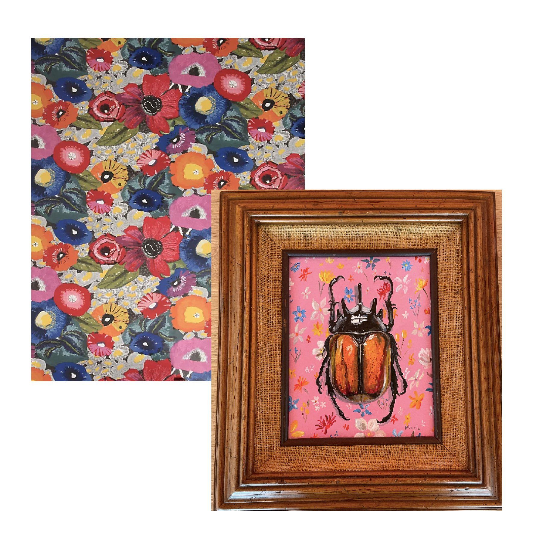
In more recent years, I have slowly evolved into somewhat of a maximalist. I don’t need a lot of things but pattern on pattern is a love language of mine. You can see, for example, a piece by Kevin Brent Morrison a gold and white patterned wallpaper in my powder room that I recently designed.
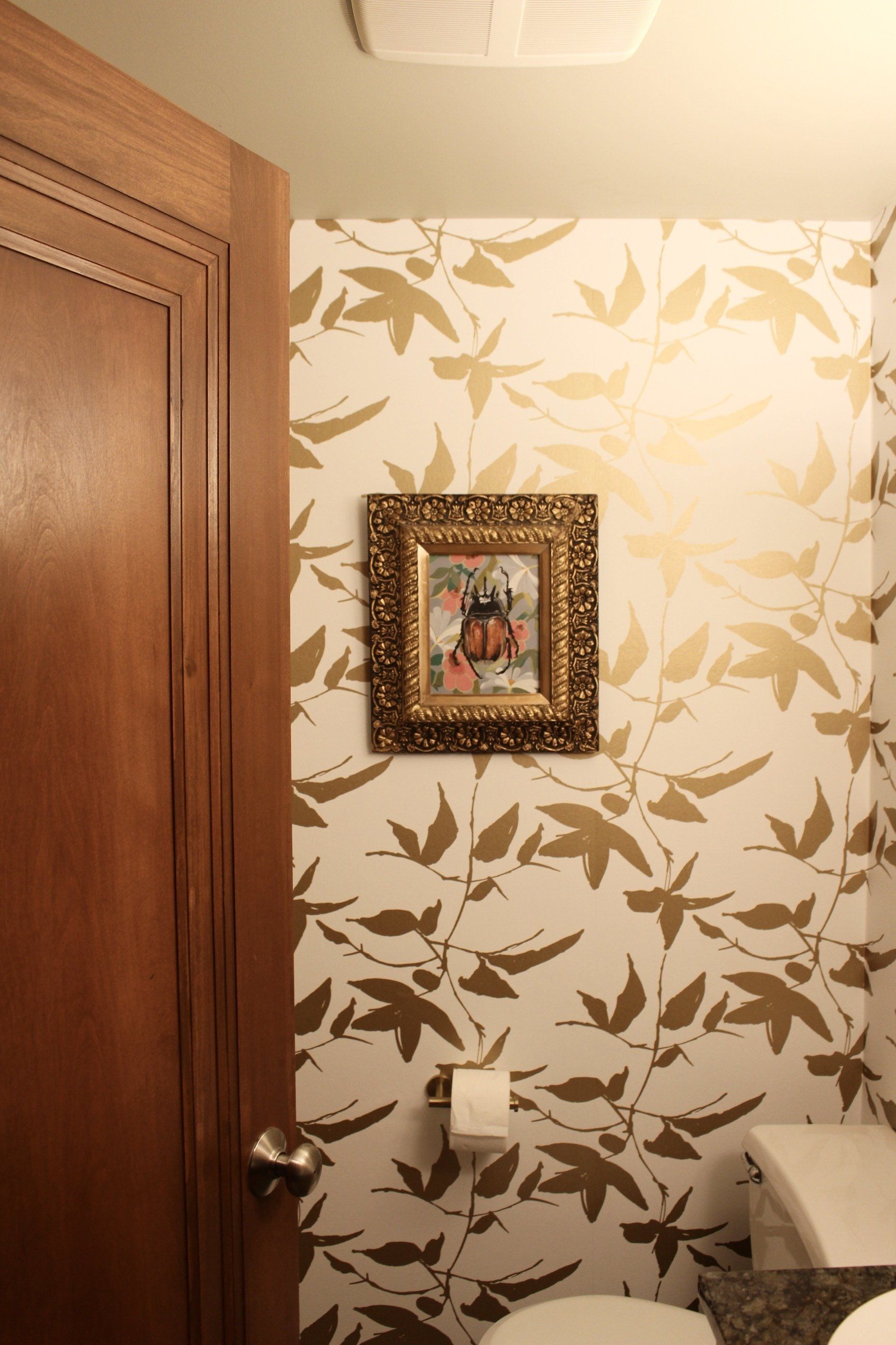
The pattern behind the beetle, the pattern in the frame, and the pattern in the wallpaper all come together to both accentuate and contrast against each other.
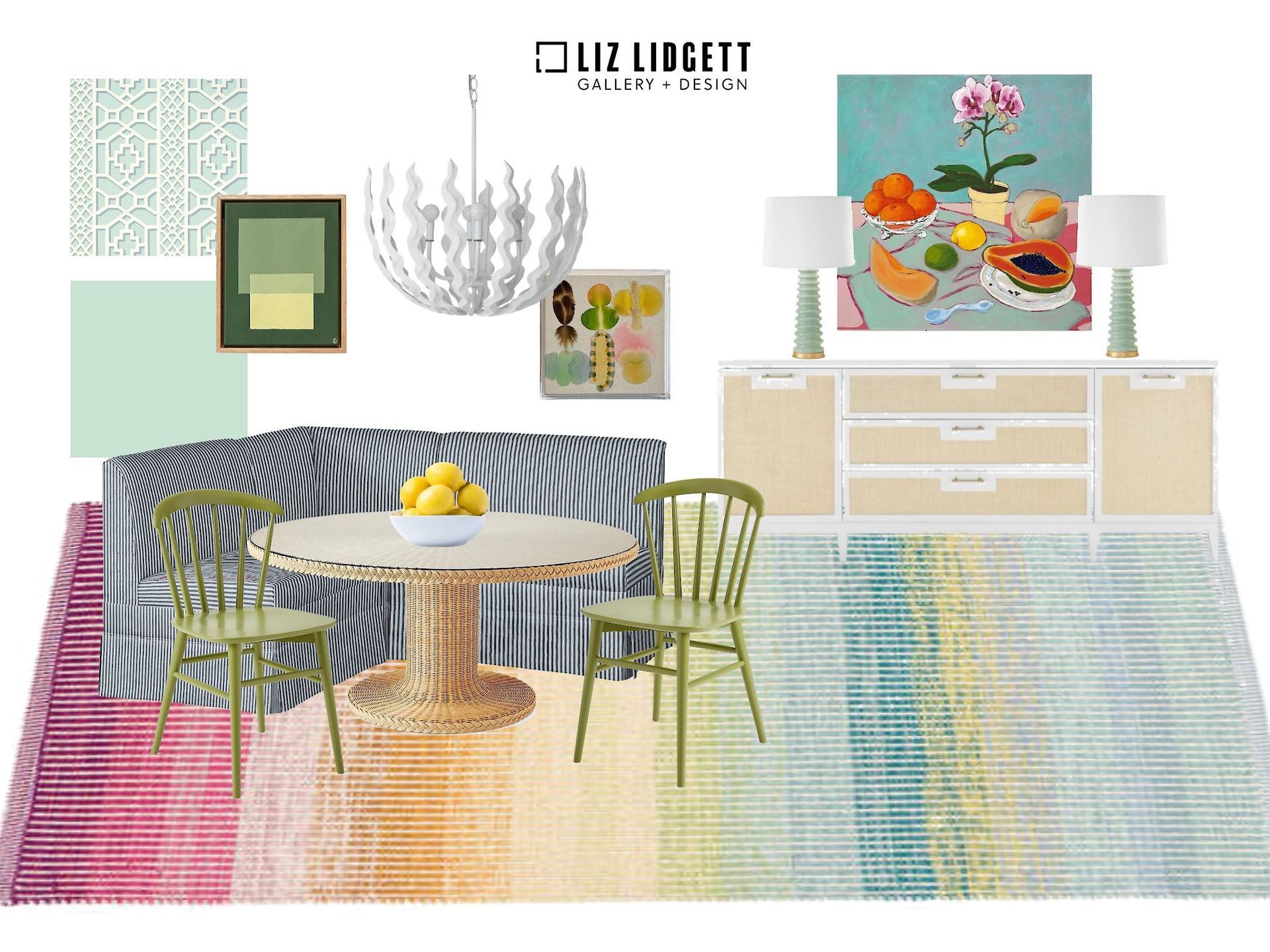
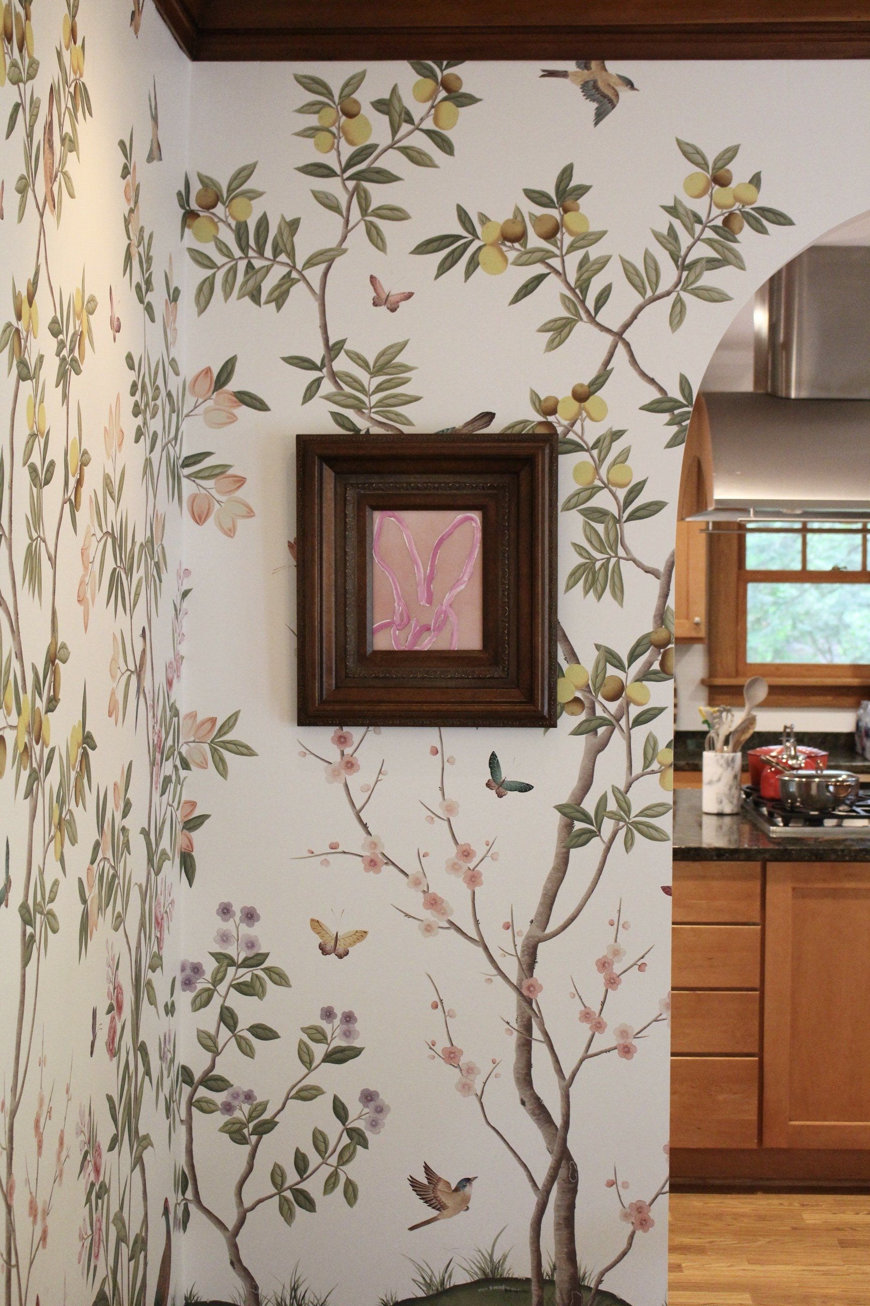
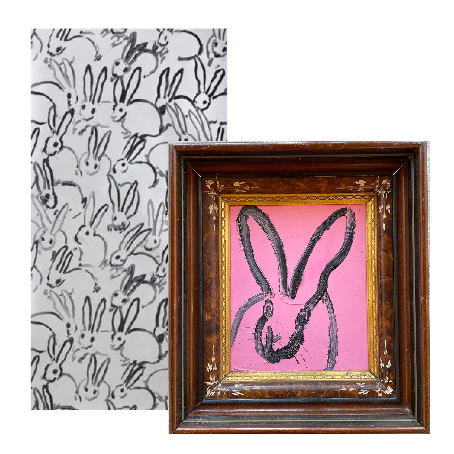
In my dining room, you’ll see a Hunt Slonembunny on top of a wallpaper mural in the perfect spot. The pink brings out the pretty light pink in the mural and it looks like a bunny might be frolicking through this scene full of greenery and florals.
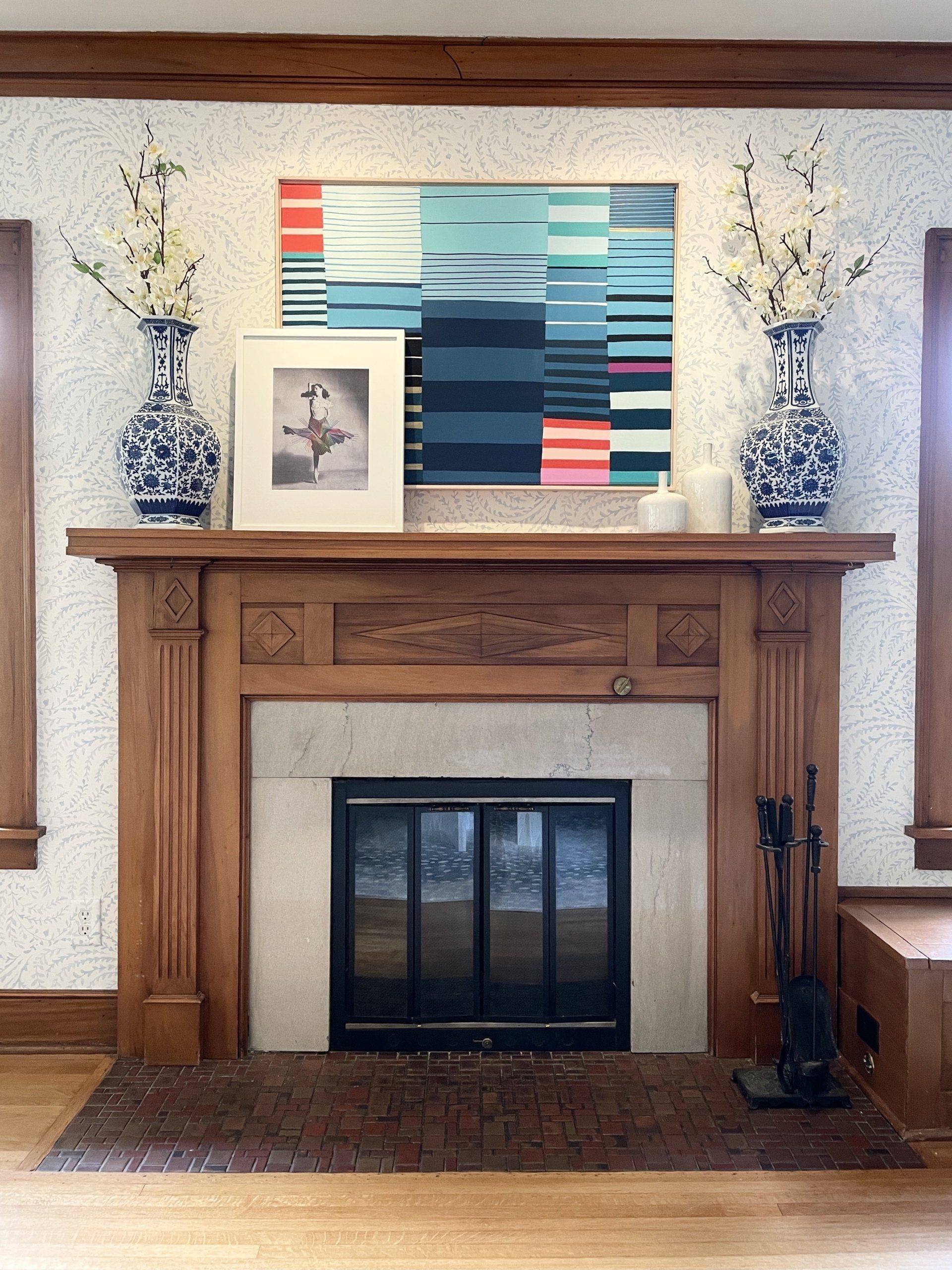
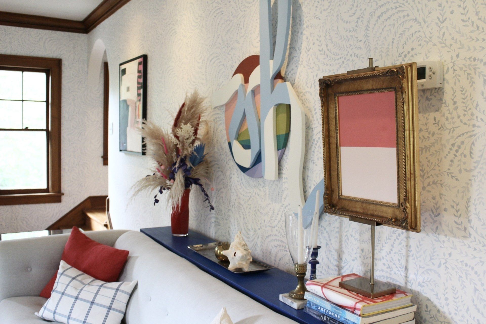
Finally, in my living room (yes, I really went all out with wallpaper) you’ll see a lot of art that goes so beautifully with the subtle leafy vine pattern.
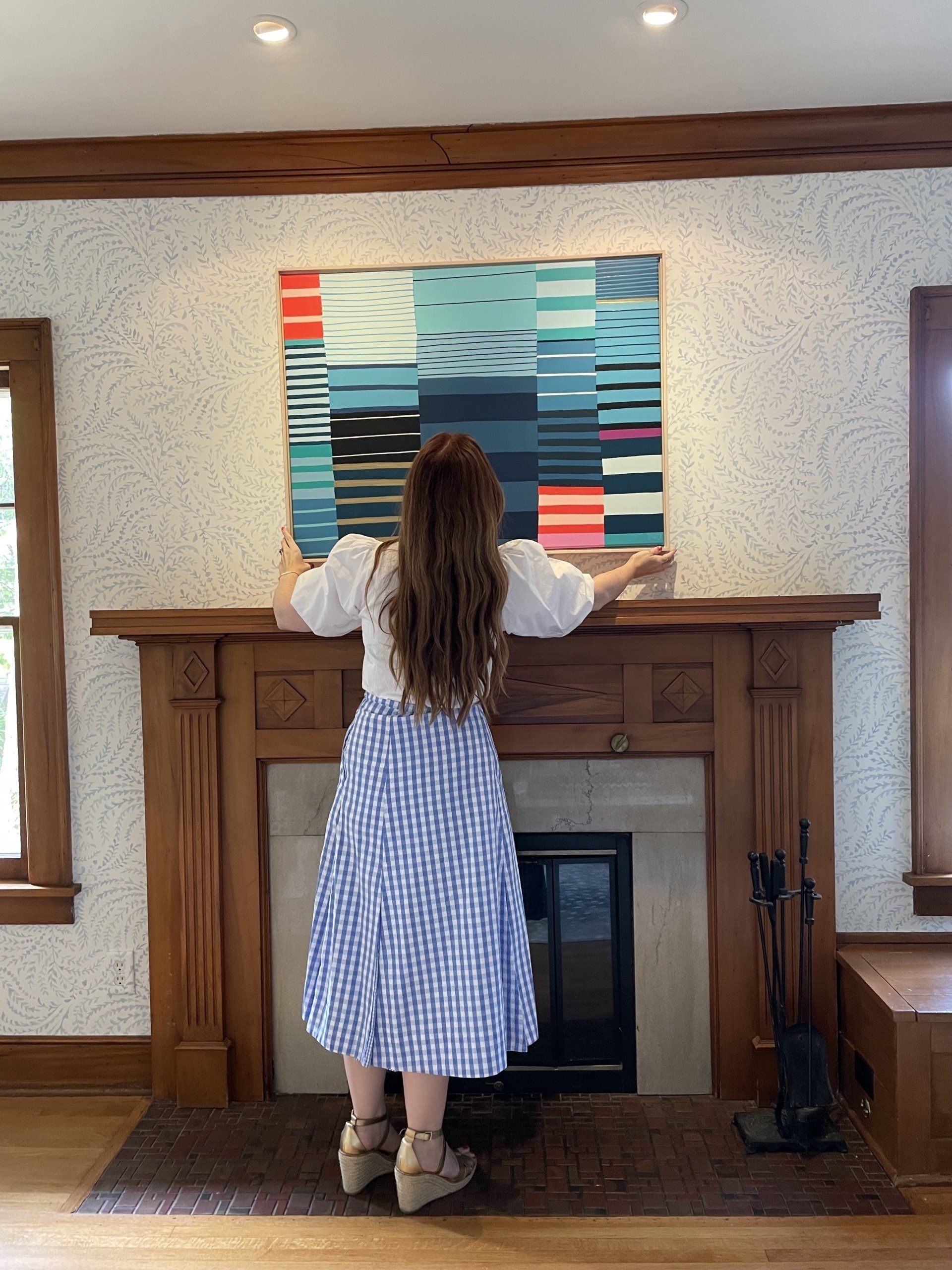
This light blue coloris one of my favorite colors to decorate with and again, I love the contrast of the more organic pattern with something more solid and geometric like both Angela Chruschiaki Blehm’s “Oh” and Katie Craig’s striped piece. Wallpaper and art are just a winning combination in my book.
Below are some offering from the gallery and my pick for a fun wallpaper combination.
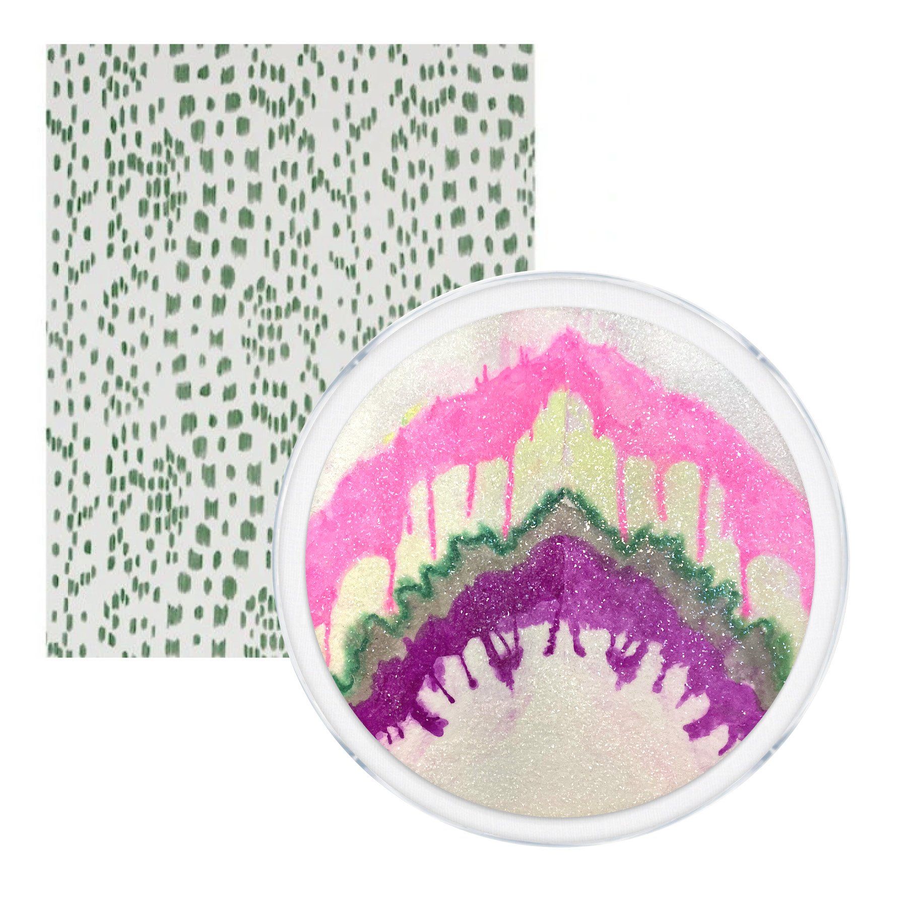
Kristi Kohut, Symphonic World + Brunschwig & Fils Les Touches Green Wallpaper
Hunt Slonem, Audrey 4 + Hunt Slonem Groundworks Hutch Silver Wallpaper
Roma Osowo, Love Surrounds Me + Katie Kime’s Cottage Stripes Wallpaper
Angela Chrusciaki Blehm, We Met + Katie Kim’s Black and White Stripe

Kevin Brent Morris, Untitled Beetle + Anthropologie Blazing Poppies Wallpaper