
Best Bold Wall Colors for Art
- By Liz Lidgett
- •
- 07 Jun, 2023
It’s no secret that I love a bold color palette throughout my house. Lots of color and lots of pattern is what makes me happiest. Here are some examples throughout my current home and our last home that show off artwork in a wonderful way.
In the past, we have looked at best white paint colors for showing off your art collection and we have looked at some fun wallpaper and art combinations but now let’s take a look at best BOLD paint colors for your artwork.
Truly, I think almost any paint color could work with the right artwork but how do you know if it does work? Well, my general rule of thumb is to find a complimentary color on the color wheel (example: blue and yellow) for the artwork to contrast off of or to find an accent color within the piece that is not a dominant color.
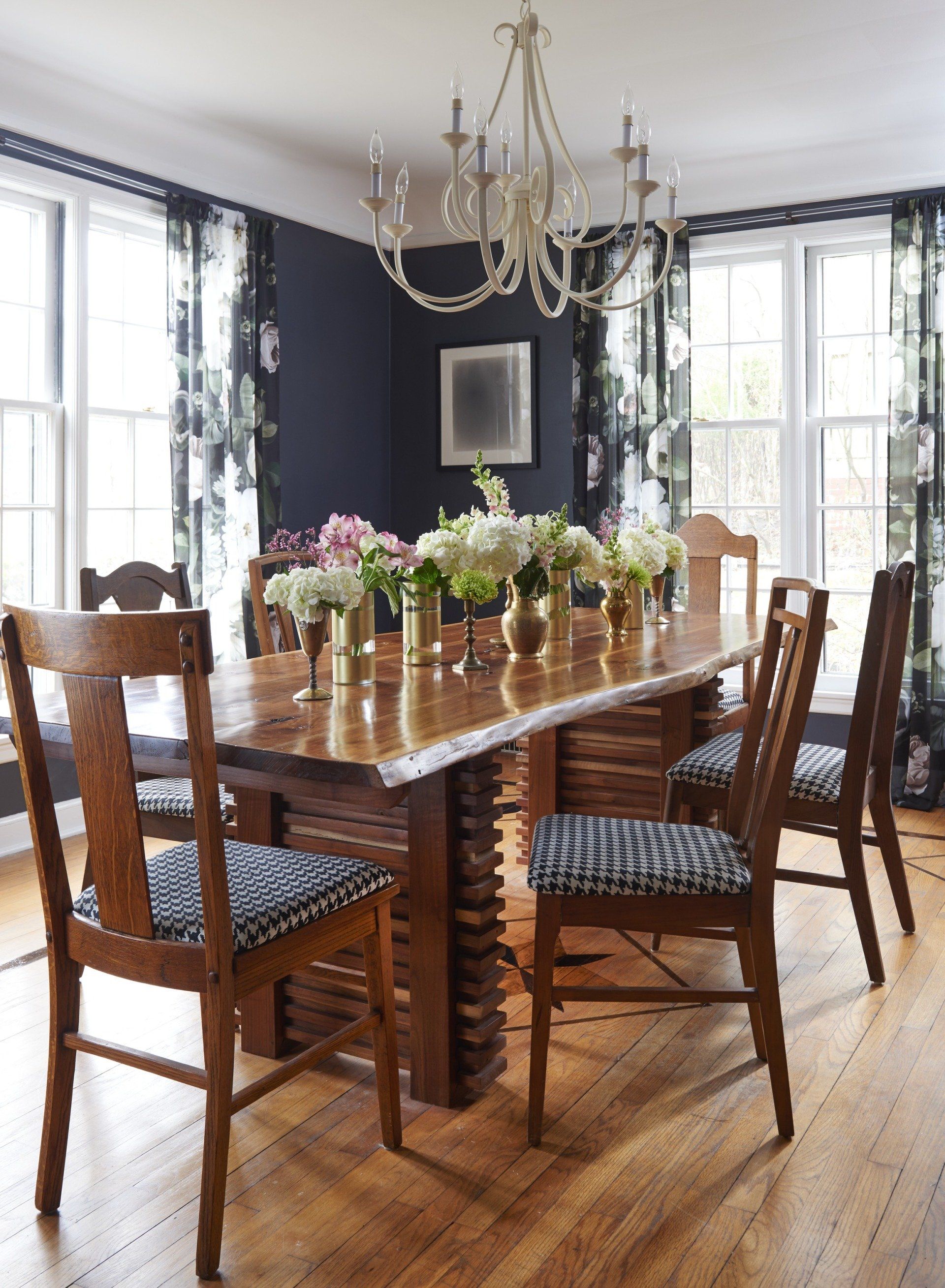
In our last dining room, I went with Benjamin Moore Baby Seal Black
for a moodiness that I thought went so well with our artwork. I personally love drama in a dining room and think that this room in particular is a room where you can really go for it. A deep, almost black like Baby Seal Black also gives a great contrast point for a variety of different artworks.
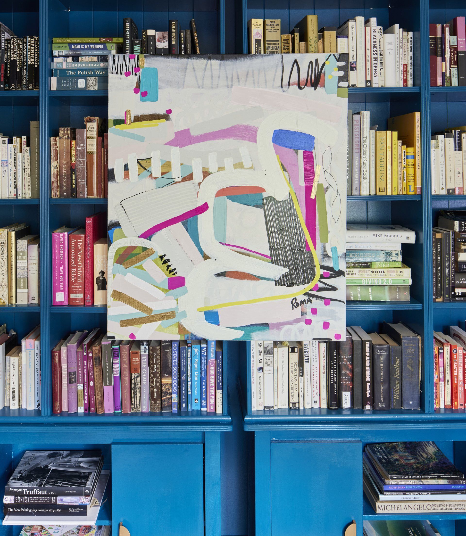
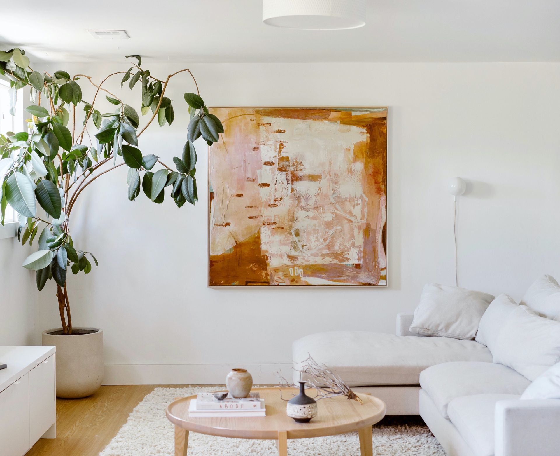
In our current home, we had a room that did not have a distinct purpose. As soon as I saw the home I had a vision to turn it into a library. I turned to our amazing realtor (Sara Hopkins) and told her– "I want this room to be a jewel box”. Hence I turned to Sherwin Williams’ Oceanside and covered the room in the shade. It’s a true jewel tone and let’s our Roma Osowo
painting stand out by pulling out the teal color throughout and complimenting the pinks and yellows.
I’ve also put together some additional pairings of artwork and bold colors that I’d love to create in real life.
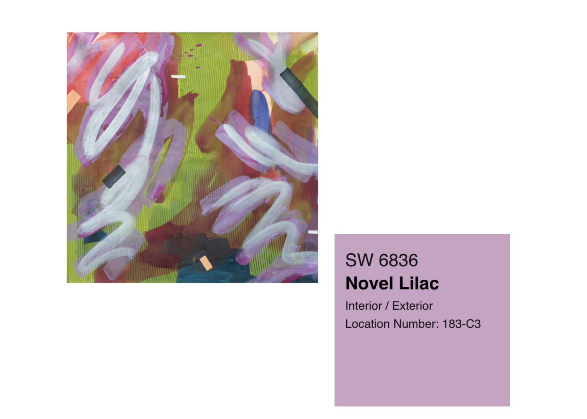
I love how the subtle purple tones in Makiko Harris' Avocado Orchid
are turned up a notch pairing them with a lilac background. Makiko’s artwork is bold on its own and it can take a fun wall color that is up to the challenge of both complimenting the work but not overpowering it.
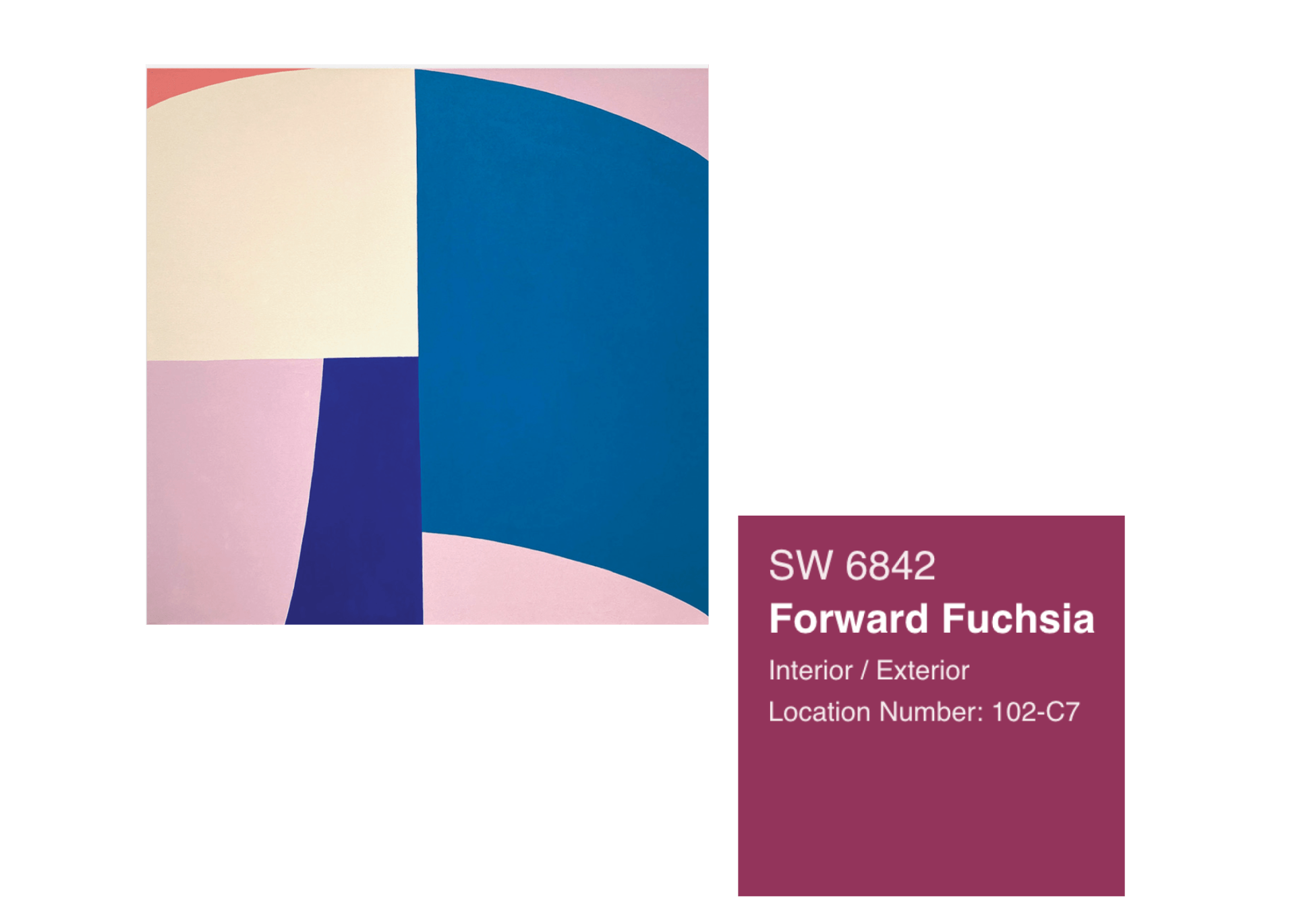
We recently used this beautiful color
in the gallery on our back wall. We have kept the color but rotated the artwork several times and I’ve been pleasantly surprised with how many different artworks and color combinations have worked with it. I think this combo of Christina Flowers' piece Summer Moon works because the light pink tones and the fuchsia are within the same color family.
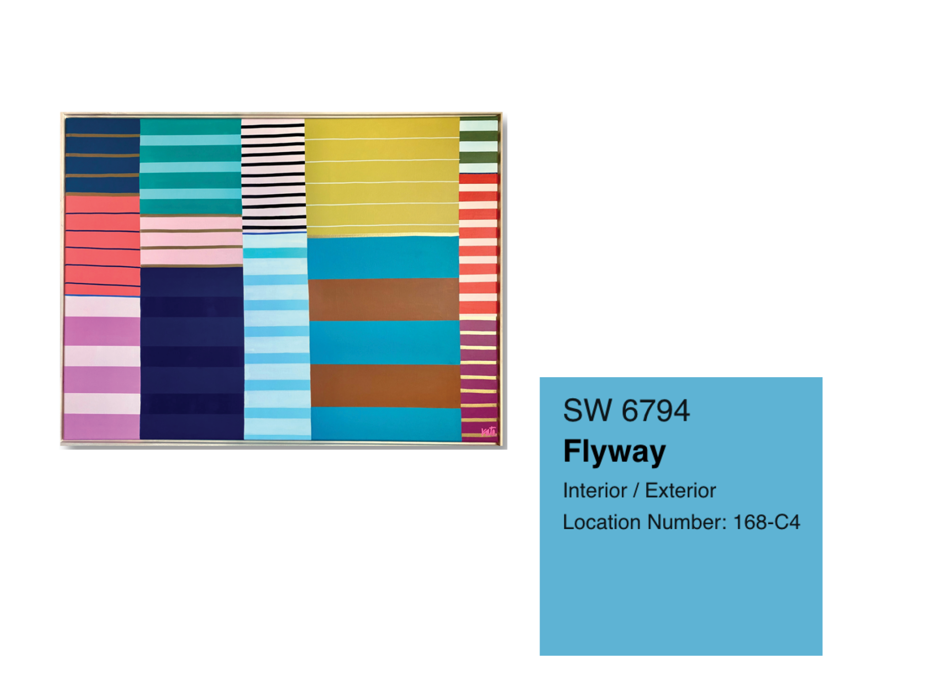
This gorgeous Katie Craig
piece titled I Dream in Ochre
has many colors in it but I decided to pull from the repeating blue stripe. This Flyaway wall color will help tie together all of the blues in the piece and give a great contrasting color to the yellow/ochre tones. Of course yellow and blue are complimentary colors on the color wheel which helps this combo really sing.
I hope this empowers you to go bold with your wall color choice as you are looking at selecting new work or looking at your current collection. Plus, we’re always happy to talk through a color consult as you’re buying work. We love a room makeover based on art!

Take a peek at these finishing touches that bring warmth and personality to each space. We hope these beautiful installations spark a little inspiration for your own home.
A vibrant, mixed-media exhibition that reimagines the timeless beauty of flowers through the distinct and dynamic perspectives of seven contemporary artists.

A look at before-and-after mural shots, insights into the artists’ painting approaches, and our process of bringing these murals to life from start to finish.