
2023 Color Of The Year Pairing
- By Aly Shearer
- •
- 29 Nov, 2022
2023 is just around the corner and all of the paint companies are releasing their colors of the year and we are swooning!
Sherwin Williams + Andrea Ferringo
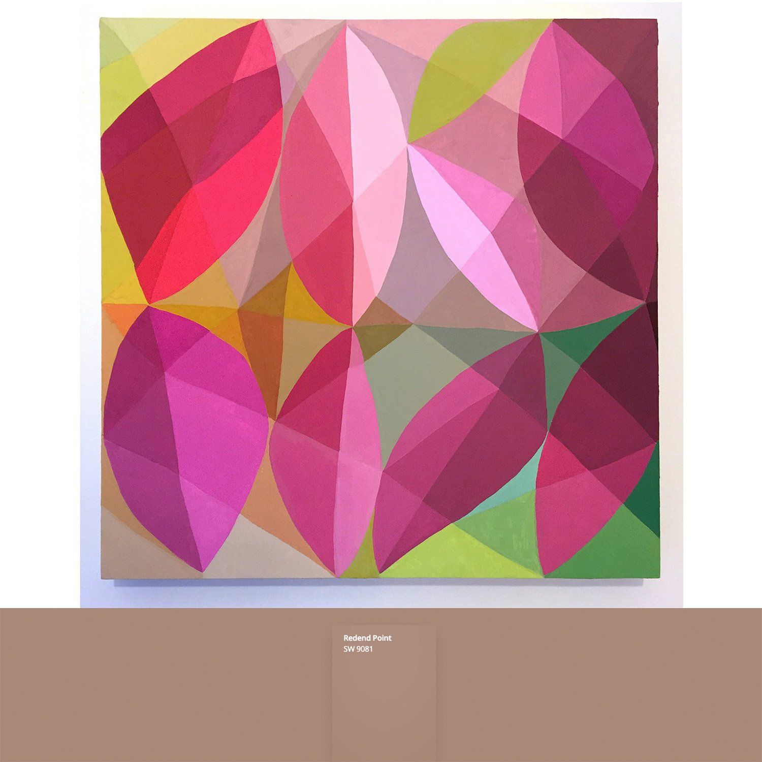
Sherwin Williams has always been a big name when it comes to the color of the year so it's only natural that we kick things off with them. This year they are going with a modern, earthy, mauve and I am loving it. It is both soft enough to blend into a room's decor and loud enough to be an accent color. Andrea Ferringo's piece Dreaming of Tulips has the perfect combination of pinks, neutrals and greens that play well with Redend Point. Andrea does such a wonderful job of creating soft dimension with the colors she places next to each other in her work and they way she worked the color and shapes together in this piece just sing.
Benjamin Moore + Christina Flowers
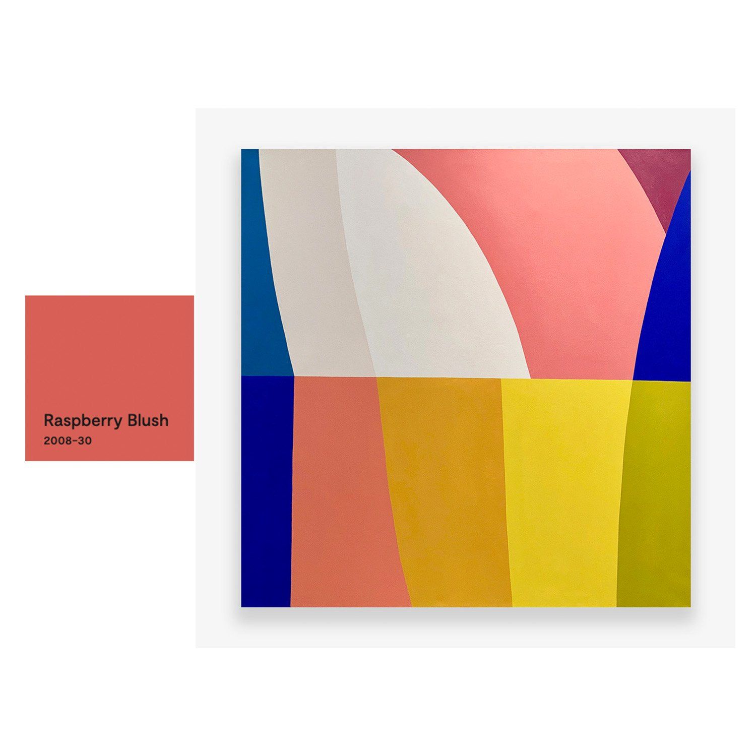
The color of the year for Benjamin Moore is the absolute perfect raspberry color. It begs to be on an accent wall or front door with its vibrancy and warm saturation. Raspberry Blush pulls out the pinks in Christina Flowers
work Step Into The Sun ii
beautifully while playing with the yellows and blues. This piece would look absolutely lovely on this color or accenting a room alongside it as a way to echo the color throughout the space.
BEHR + Joy Kinna
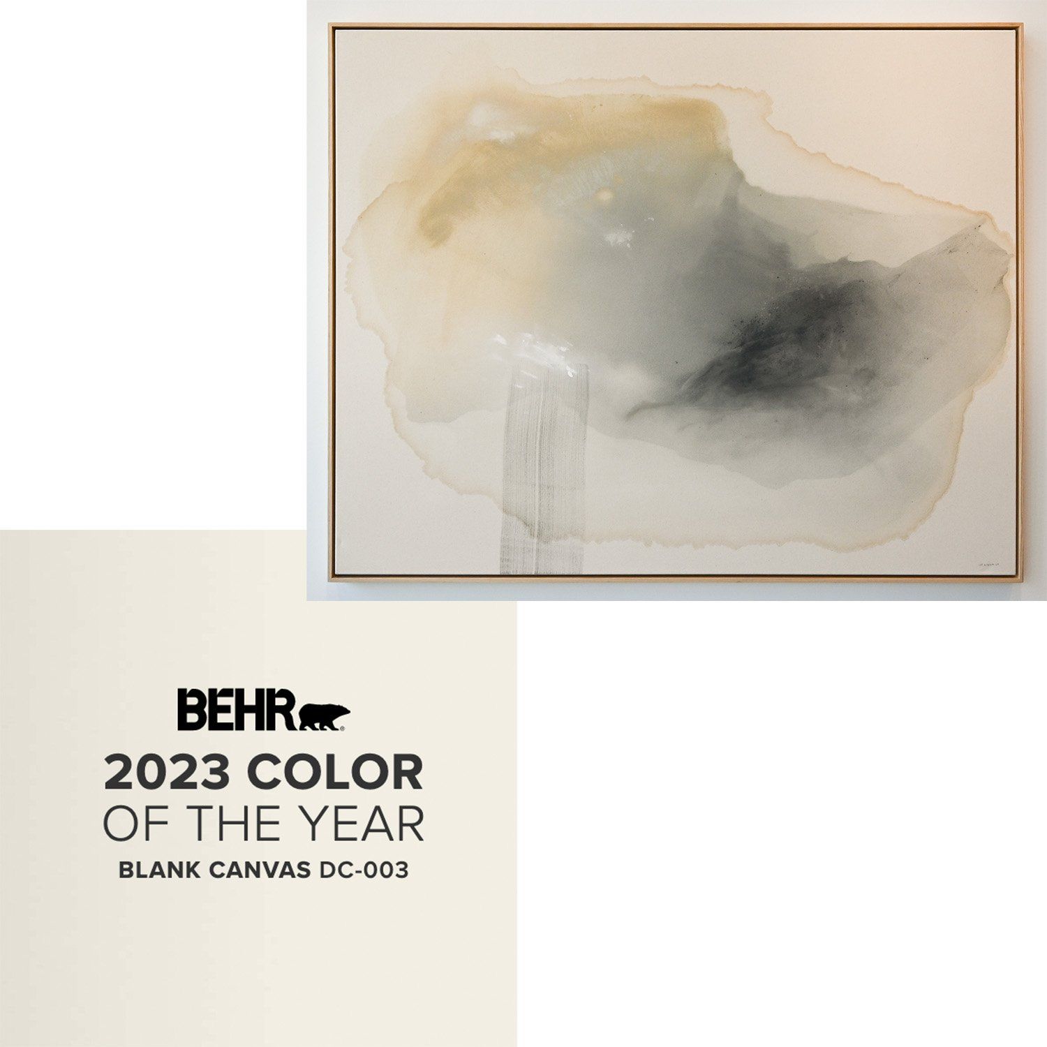
Joy Kinna's work is soothing and versatile and that is exactly what BEHR was going for this year with their choice in color of the year. They chose Blank Canvas which is a soft and warm white that fits in with every style and decorating style. Our Time Together is the perfect pairing with this color - they are both soft and warm, allowing for a more relaxing and serene environment.
Glidden + Roma Osowo
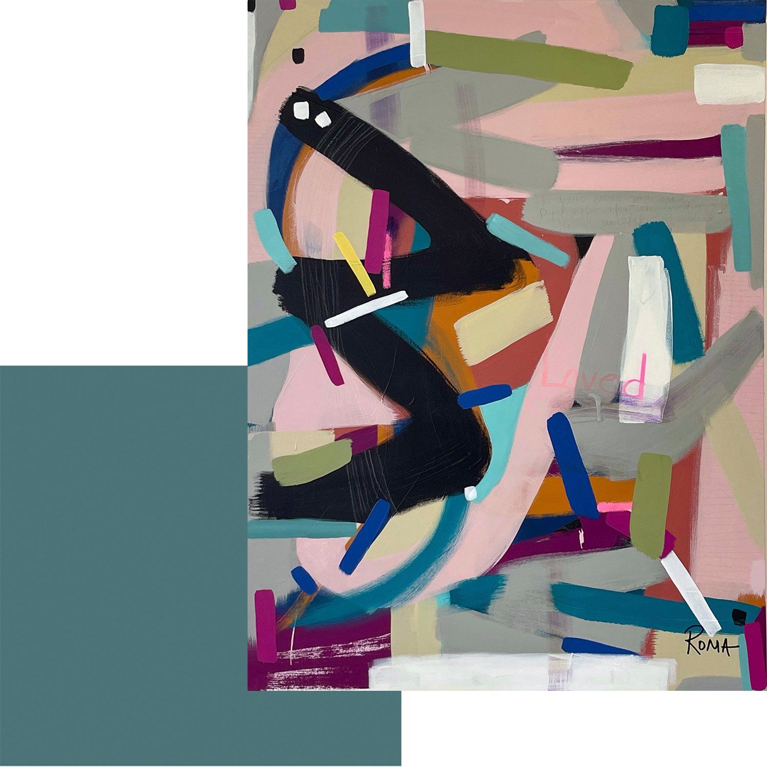
Roma Osowo is known for her gorgeous, vibrant, color palettes and energetic mark making and her piece Every Good Thing iii is no exception. This gorgeous piece is filled with pinks, blues and neutrals which makes it a pretty versatile piece, but alongside Glidden's color of the year, Vining Ivy, the teals that are in the piece really have their time to shine. Being a recovering teal obsessor, this color has to be one of my favorites in the piece and the pairing with Glidden's Color Of The Year really makes my younger heart happy.
Krylon + Shelby Monteverde
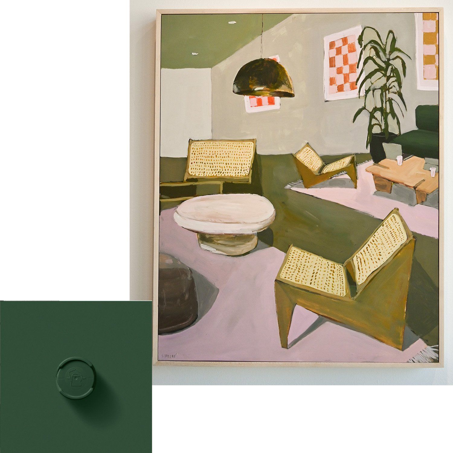
Green is really having a moment right now and I am here for it. Krylon, the spray paint company, came out with their color of the year and have decided on this decadent green called Spanish Moss. Because it is a spray paint it is more than likely going to be used for accents around the home and Shelby Monteverde's
piece, South Congress Hotel Lobby, has the perfect little accent tie in. While there is a soft olive green throughout the piece the couch along the edge of the painting is the same deep emerald as the color of the year and would be the perfect accent for the accent color - tying it into the space with the other colors included.
2023 is already looking like a year full of color and beauty, I hope these pairings follow you into the new year and inspire you to fill your space with things that bring you joy.

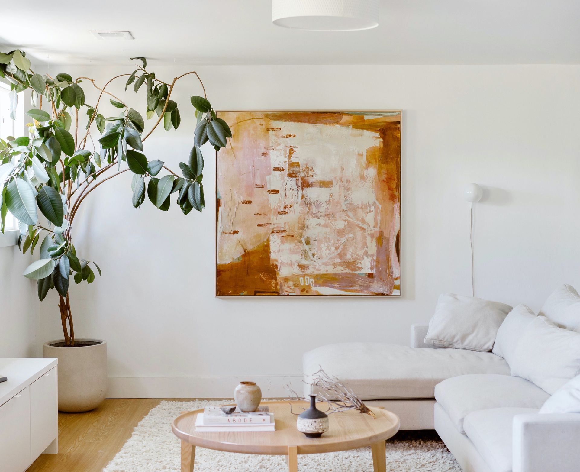
Take a peek at these finishing touches that bring warmth and personality to each space. We hope these beautiful installations spark a little inspiration for your own home.
A vibrant, mixed-media exhibition that reimagines the timeless beauty of flowers through the distinct and dynamic perspectives of seven contemporary artists.
A look at before-and-after mural shots, insights into the artists’ painting approaches, and our process of bringing these murals to life from start to finish.