
Dream Clients: Taylor Swift
- By Aly Shearer
- •
- 07 Nov, 2022
In honor of her newest album, Midnight, we wanted to pair some amazing art with the overall feel of some of her most iconic albums.
Kevin Brent Morris + Taylor Swift
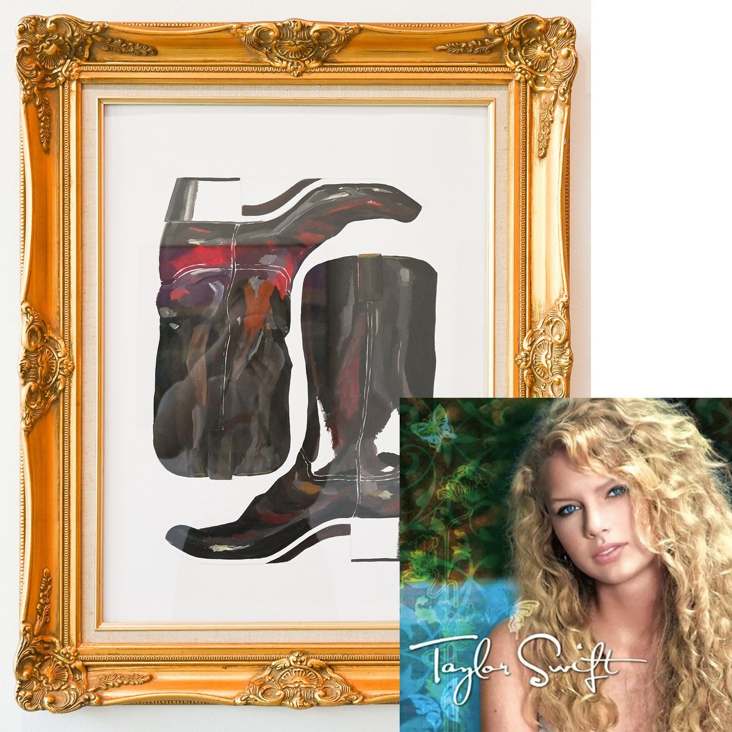
Taylor's,
self titled, debut album is much less well known than the rest of her works, but does not make it any less of a show stopper. This gorgeous collection of songs came out in 2006 and launched Taylor into the world of country music. She sang songs about teenage heartache and the life she lead. I paired this album with Kevin's piece,
Idols of the West 5, because this beauty was around the time that he was launching himself into the professional art world and embodies a classic country feel that Taylor was inspired by in writing this first album.
Fares Micue + Fearless
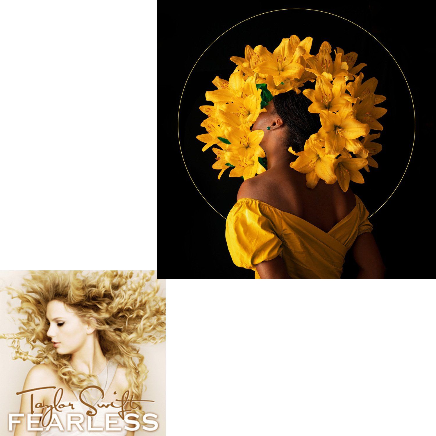
Fares' work is always dreamy and romantic; each piece is a statement on how she sees the world and interprets the life she is living. Her stunning piece, Sunset Kisses, reflects Taylor's album, Fearless, in many ways. The album cover is dominated by Taylor's golden hair and Fares' piece is dominated by the golden halo of blooms and both of them feel as though they are saying something through the pose that you just don't understand. Each song on the album tells you more about Taylors journey into fame and each piece by Fares reveals more about what she is trying to say through her photography.
Jenna Brownlee + Speak Now
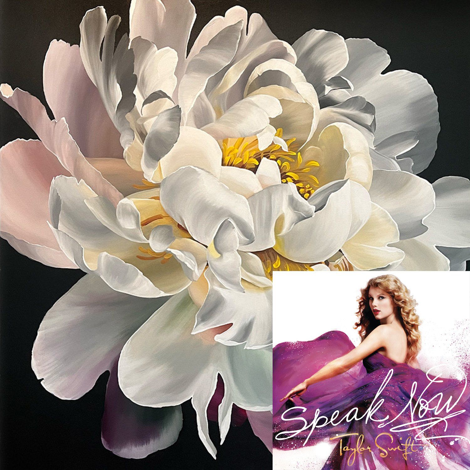
Taylor's album, Speak Now,
was the last album she produced with the same feel as her previous work; it was her last country album and you could really feel her developing into the artist that she was going to be. She was still soft and sweet, but she was starting to get her edge. I chose to pair this album with Jenna's work, Dusk, because of the elegance of the bloom as well as the darkness of the background. Taylor was starting to see the negative affects of fame and was starting to see the darkness in it, during this time, but she used that darkness to develop herself into the artist she wanted to be.
Katie Craig + Red
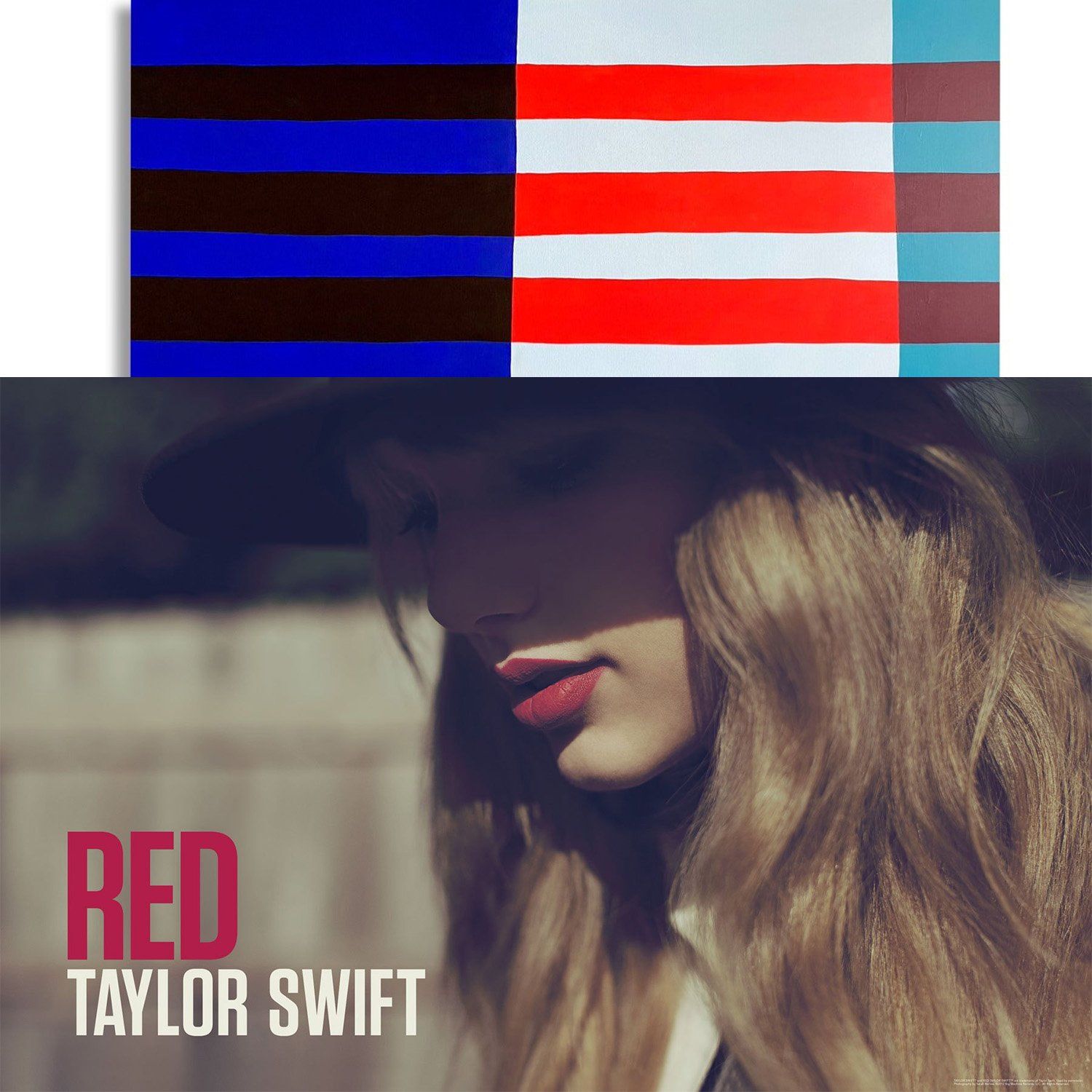
While stripes are incredibly timeless, 2012, when Taylor's album, Red, came out, they were having a particularly loud moment. She wore a lot of stripes and red on her tour and really leaned into dressing borderline nautical. Katie's work often aires on the side of nautical and Deep Sea is no exception - it's both bold and familiar . This was also the album that Taylor strayed from her country roots and started leaning into pop and Katie is entering a new phase of her work where the lines are a little less structured and a little more organic. Both Katie and Taylor are transitioning into a new version of their art form.
Kristi Kohut + 1989
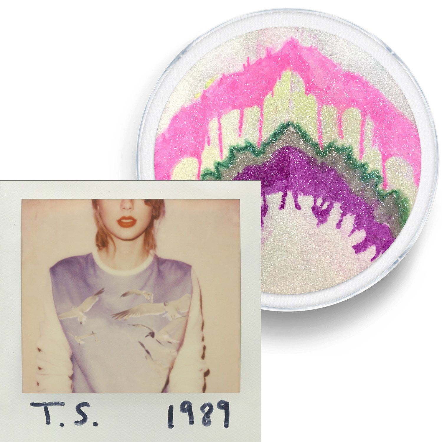
I'm not sure if you remember her looks on the tour for 1989, but Taylor
wore a lot ( a lot ) of sparkles. Kristi is kind of the queen of sparkles, so it was only natural that 1989
would be paired with Symphonic World #2. This album, Taylor, also starts leaning into a little bit more of her edgy side. She was dealing with a lot of backlash from people about moving away from country during her Red
album and this only heightened her fame, which was both wonderful and wonderfully difficult for Taylor. Symphonic World #2
fits with 1989
not just because of the tour looks, but also because it is a little edgy and heavy while being absolutely stunning and catches the eye of anyone who enters the room. 1989
was an album that really allowed Taylor to express that she feels more than just love, she is multidimensional, Kristi's piece echos that same sentiment.
Paige Barnes Dorsey + Reputation
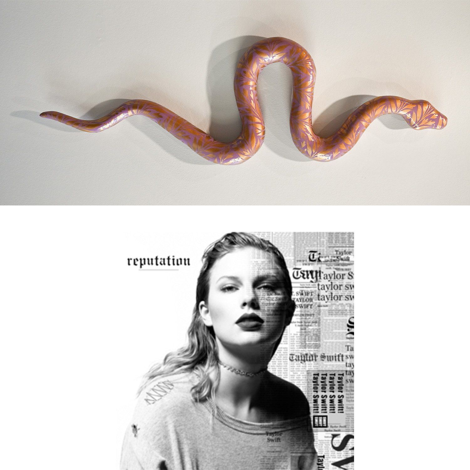
When first coming up with the idea of making a blog post with art connected to Taylor's
albums, this pair was the first in my mind. Paige's
artist statement states "[Traditional elements]...represent polite society; and reminds us that often it's not the garden snakes you should fear, it's the ones sitting around the table at the garden party." and that is what the whole album echos that same sentiment. Taylor had been burned and she was not afraid to talk about it. She was leaning into the fact that she had a platform that she could talk about the heartache that she was dealing with and she wasn't just sad - she was angry. Along with this, she wore a lot of snakes on the tour and in her music videos, so the connections are both literal and conceptual.
Hunt Slonem + Lover
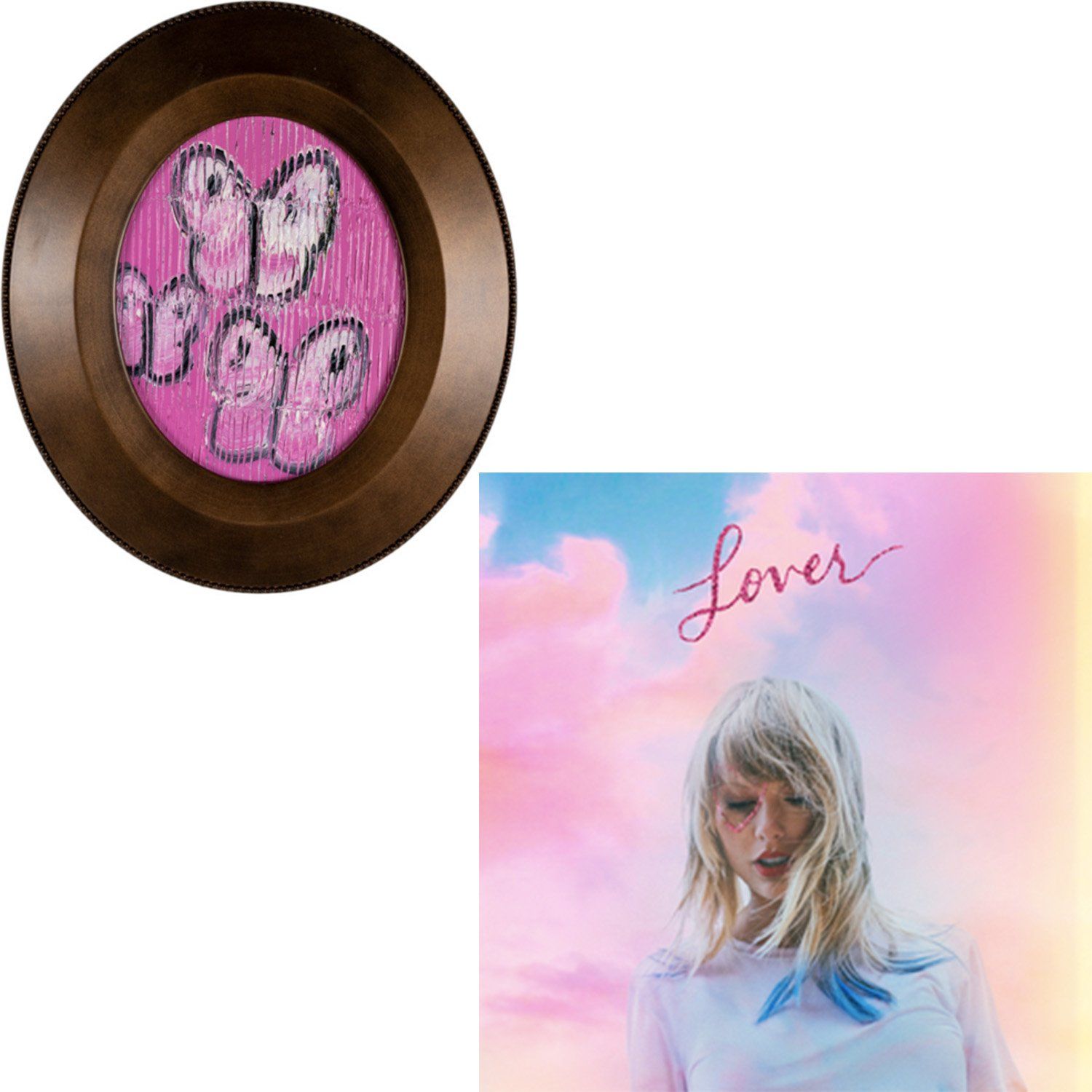
Hunt's
work is playful and romantic and that could not be a better reflection for Taylors
album, Lover. Throughout the promotional material and the music videos there is an underlying theme of pastels, botanicals and butterflies, which is echos all througout Hunt's work, but especially in Three Cabbage. The lines etched into the paint connect with some of Taylors more edgier songs on the album, while the subject matter echos the sweet romance that is the main theme of the album.
Meghan Bustard + Folklore + Evermore
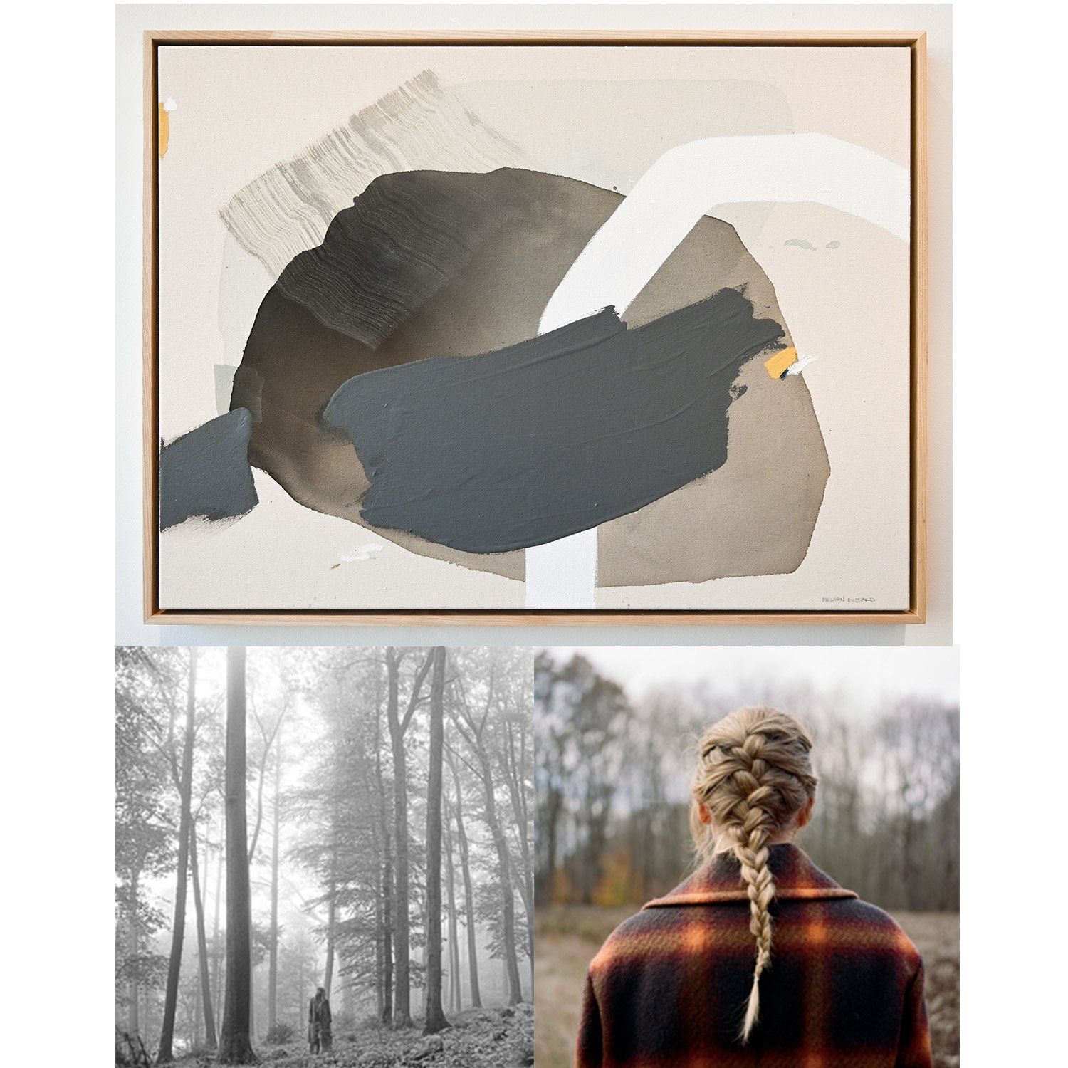
I know, I know, Folklore
and Evermore are not the same album, but they are sister albums that came out within the same year and they have a very similar feel with the both of them. They are both cozy and nostalgic and are within the same era. I chose Meghan's
piece Every Once In A While
because it has the same, calm, cozy and comforting feel to it. The songs on these albums echo a lot of her early works which was a really sweet way to lean into her Taylors Version era of revisiting old music and taking back the ownership of who she has been and who she will be. Because of the layering in this piece it feels as though it, in and of itself, as a nod to a passage of time and noting the different eras Meghans work has been in. These are all pieces of reflection and understanding.
Thank you for walking down memory lane with me. What piece of art do you feel goes best with Taylors newest album? As always, we are so excited to see what she creates next.

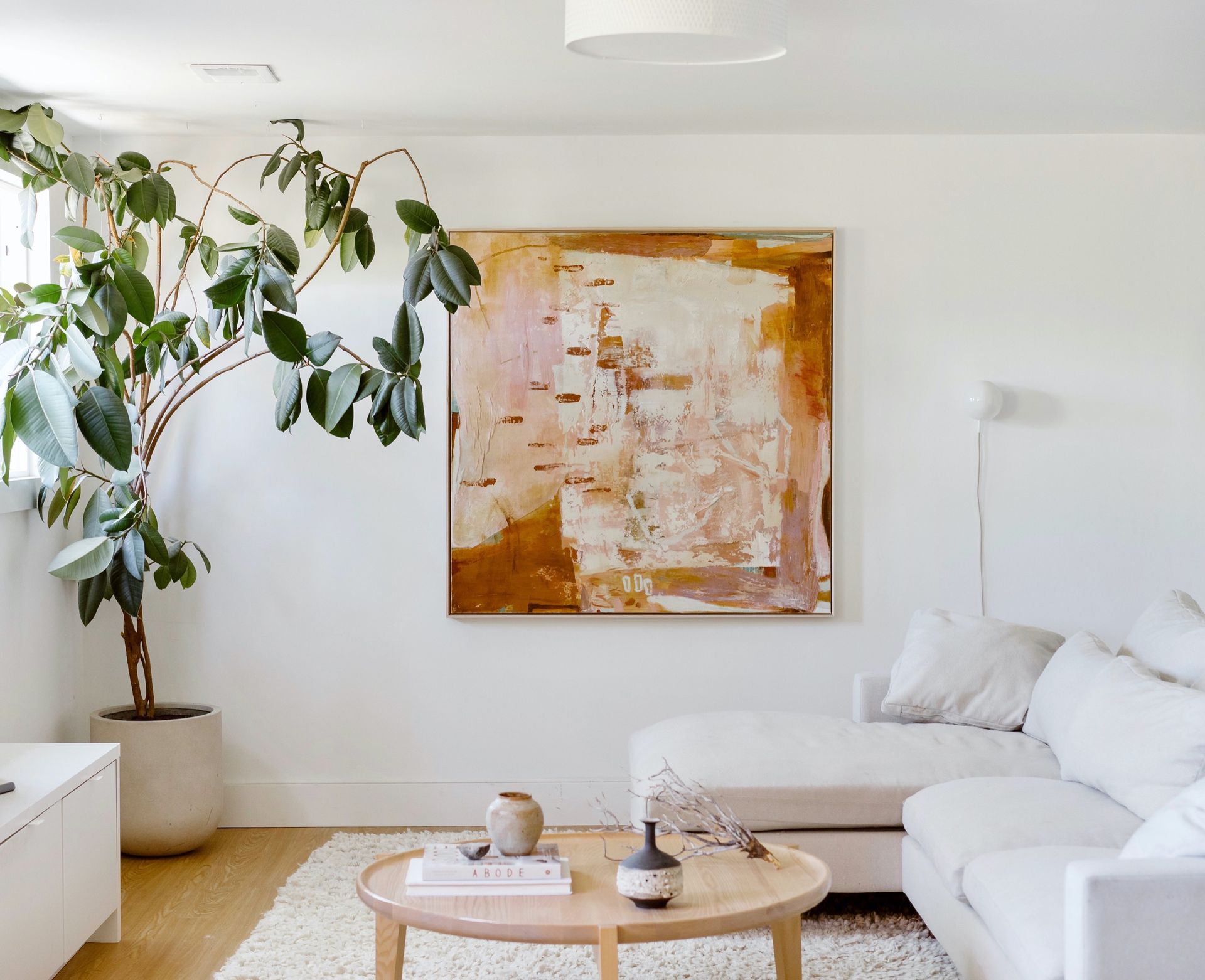
Take a peek at these finishing touches that bring warmth and personality to each space. We hope these beautiful installations spark a little inspiration for your own home.
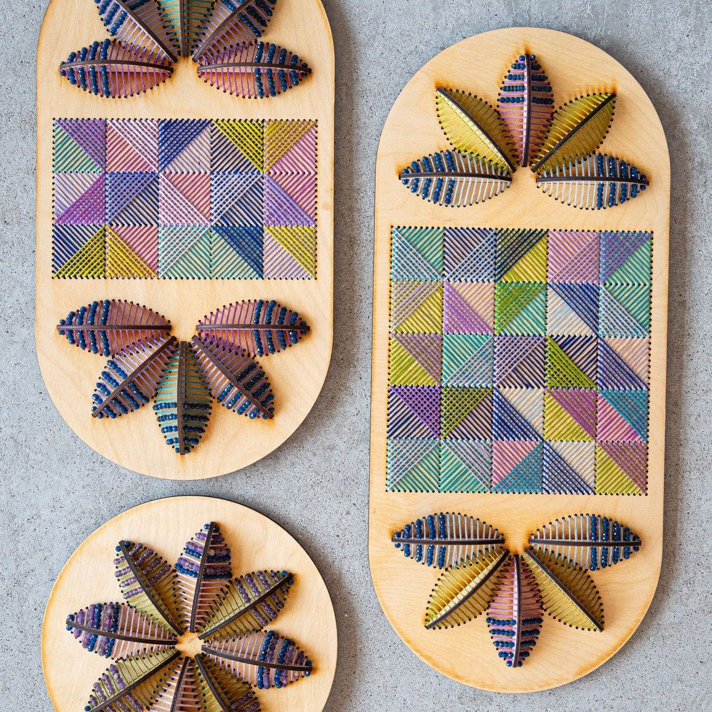
A vibrant, mixed-media exhibition that reimagines the timeless beauty of flowers through the distinct and dynamic perspectives of seven contemporary artists.
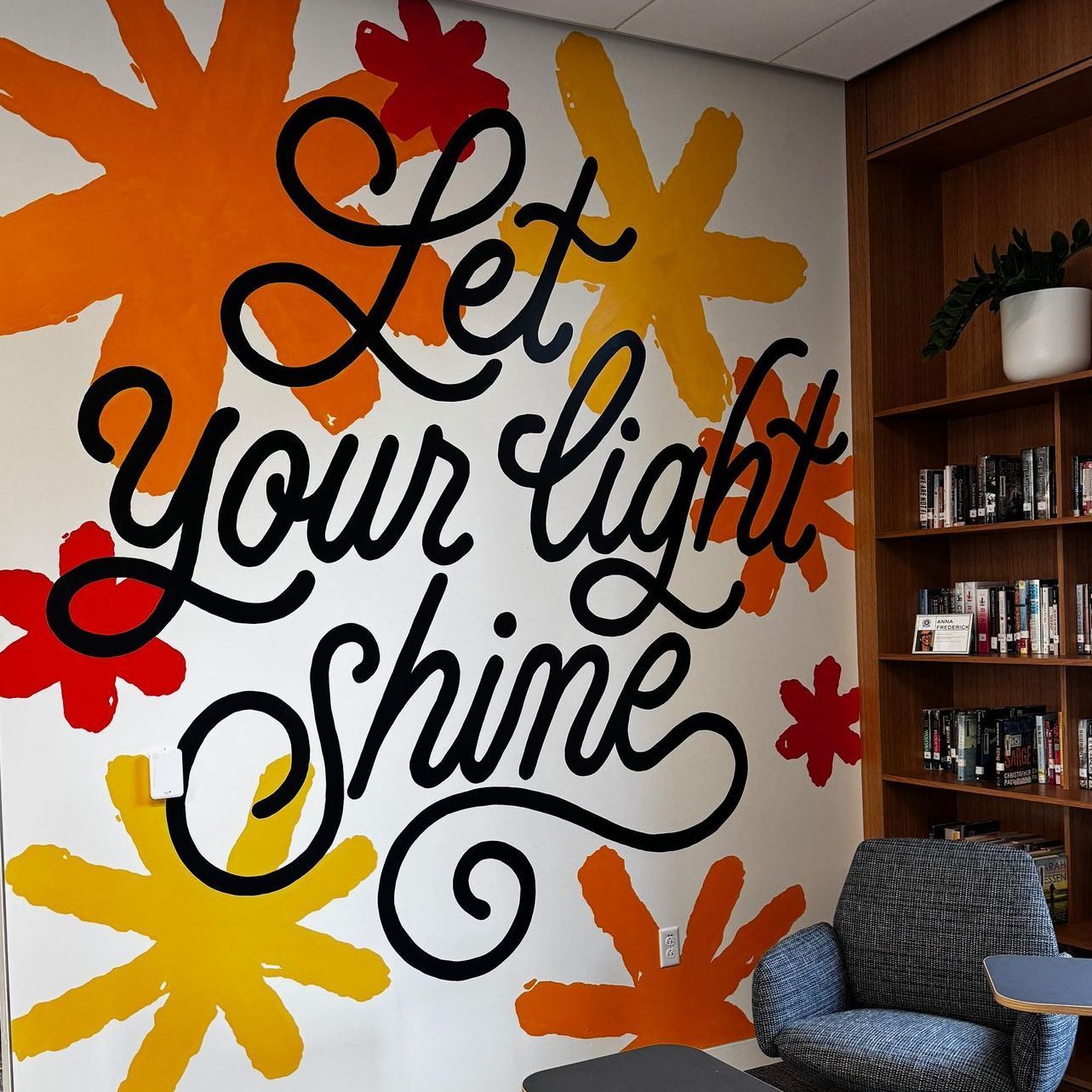
A look at before-and-after mural shots, insights into the artists’ painting approaches, and our process of bringing these murals to life from start to finish.